
The first pages of a calligraphy pad are usually a disappointment. The strokes wobble, the ink pools in the belly of the a, the nib snags and spits. It happens to anyone who has ever picked up a broad-edge pen, and it says nothing about talent. Almost every beginner problem comes from a short list of habits, and each one has a fix you can practise in a single sitting. Below are the five that show up most often on a beginner's paper, what actually causes them, and the drills that clear them up.
Shaky Strokes: The Hand That Won't Hold Still
A wobble in a thick downstroke is the most visible beginner problem and the least mysterious. It usually comes from one of three places: you are writing faster than your hand can control, you are moving from the fingers and wrist instead of the arm, or you are gripping so hard that the pen has to fight you. A broad nib magnifies all three. A tremble that would be invisible in ballpoint becomes a mountain range at three millimetres wide.
Start by halving your speed. Watch the line rather than the finished letter. Then change the motor: for anything taller than about two centimetres, the movement should come from the forearm and shoulder, with the fingers holding the pen steady instead of steering it. Rest the forearm lightly on the desk and let the elbow travel. The hand should glide, not twitch.
A five-minute warm-up
Before any session, fill roughly half a page with straight vertical lines three to four centimetres tall, spaced about one nib width apart, drawn at an even pace and with the whole arm. Follow with a row of ovals leaning the same way, then a row of horizontal lines. You are not making anything pretty; you are reminding the arm what a consistent stroke feels like. Most people find their lines are steadier by the third row.
If the line wobbles, the answer is almost never more strength. It is less speed and a looser hand.
The Death Grip, and the Pen Angle That Follows It
Ridges on your fingers after ten minutes, an aching forearm, and writing that gets smaller and tighter as the page goes on are all signs of the same problem. Here is a simple test: ask someone to slide a sheet of paper out from under your writing hand while you hold the pen in position. If it will not budge, you are pressing far too hard.
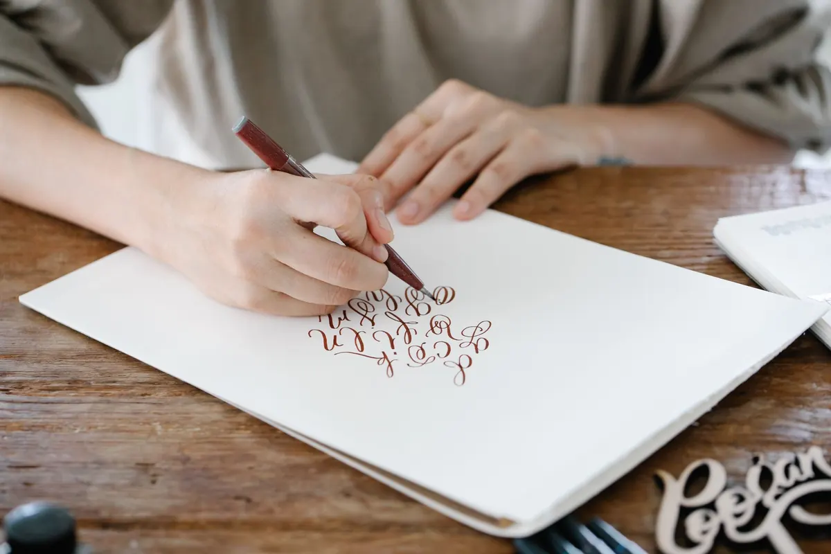
For a broad-edge pen, hold the holder two to three centimetres above the nib, thumb and index finger on either side, middle finger supporting from below, ring and little finger resting on the paper as a sliding rail. Keep the pen roughly in line with your forearm rather than angled across the page. Relax your shoulder before you begin; tension travels down and lands in the nib.
Pen angle is the other half of the grip. For italic, the nib edge sits at roughly 30 to 40 degrees to the baseline, and it must stay at that angle for every stroke. When the angle drifts, your thicks and thins move around the letter and the whole page looks uneven. A sliver of tape or a small dot of nail varnish on the holder, lined up with the nib edge, gives your eye something to check until the angle becomes automatic.
Ink Flooding: The Blob at the Bottom of the Letter
A pool of ink spreading out of the last downstroke usually has a simple cause. You dipped too far up the nib, you did not tap off the excess, or you paused with the nib resting on the paper and let gravity do its work. Thin, runny ink and very absorbent paper make it worse.
- Dip only to just above the vent hole, never up to the holder.
- Tap the nib twice on the inside rim of the pot instead of wiping it on a cloth.
- Test the first stroke on a scrap sheet before committing to the good paper.
- Keep the pen moving; lift the nib at the end of a stroke rather than parking it.
If flooding persists, load the nib with a small brush instead of dipping. You get far more control over how much ink sits between the tines. Use ink made for dip pens rather than fountain-pen ink, which is formulated to flow through a feed and behaves like water on a flexible nib. And give smooth, well-sized paper a try, since heavily textured stock drinks ink and pulls it sideways.
Skipping, Railroading and Hairlines That Vanish
New nibs arrive from the factory with a thin film of oil that repels ink. If yours skips from the very first stroke, scrub it gently with a little toothpaste on a soft cloth, rinse and dry it, and try again. Never use anything abrasive enough to change the shape of the tines.
Railroading is different: on a flexible pointed nib, two thin parallel lines appear where one thick downstroke should be. It means you pressed hard enough to split the tines while the ink supply could not keep up. Lighten the pressure, reload more often, and slow the downstroke slightly so the ink has time to follow the nib.
Broken hairlines and snagging upstrokes tend to be a pressure problem too. A pointed nib needs almost no weight on the upstroke; a broad-edge nib needs a consistent angle so that a corner does not dig into the paper. Rougher paper will catch the tip no matter how light your hand is, so keep a smooth pad for practice and save the toothy stock for finished work.
Practising Finished Letters Before You Can Draw a Stroke
It is tempting to skip straight to words, flourishes and the script you saw on a wedding invitation. But letters are assembled from a handful of strokes, and if the i stroke, the oval and the entry serif are not reliable, nothing built on top of them will be. The other common shortcut is working without guidelines, which produces letters of drifting height and a slant that wanders across the page.
Rule up properly. You need a baseline, a waistline, an ascender line and a set of slant lines at a consistent angle. Slip a printed guide sheet under smooth layout paper and the lines show through without needing to be erased. For italic, an x-height of four to five nib widths is a sensible starting point; anything much smaller gets cramped and muddy.
Drills worth the paper
- Rows of straight vertical stems, evenly spaced, at a steady pace.
- Ovals in a continuous rhythm, all leaning the same way.
- Chains of the i stroke joined by exits, to train the entry and the release.
- One letter written large, ten times, comparing each attempt with the model.
- The same letter written small, to check that the stroke pattern survives at size.
Comparison is where the learning happens. Write a letter, put the model beside it, and name one concrete difference — "my bowl is too round" or "my stem leans left". Fix that single thing on the next line. Ten focused repetitions beat a full page of hopeful copying.
Pulling It All Together
Twenty minutes a day will take you further than three hours on a Sunday. A workable structure: five minutes of warm-up lines and ovals, ten minutes on the current drill, five minutes on one letter compared against a model. Keep your dated practice sheets in a folder and flip back through them once a month — the progress that feels invisible day to day is obvious across four weeks.
Keep one scrap sheet beside your good paper for testing ink and angle, and stop a session when your hand starts to ache rather than pushing through it. Calligraphy rewards patience far more than force. Slow down, loosen your grip, load the nib properly, and give the basic strokes the time they deserve; the elegant pages come later, and they do come.
Photo: Katya Wolf / Pexels