
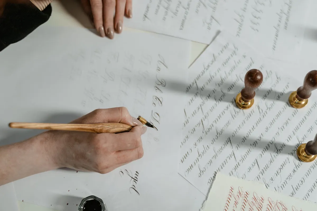
Lettering has a way of slowing a room down. A small pot of ink, a nib that has been broken in, a sheet of cream card stock—these are modest materials, but they ask for attention. The projects below follow the calendar rather than a trend. Each month has one clear job, chosen to suit the light, the mood, and the stationery you are likely to have within reach. Some are quick enough for a rainy afternoon; others can be spread across a week. Keep the results imperfect. A slightly wobbly flourish or a label cut by hand is part of the vintage character. The point is not to produce a shop-window display but to make a few useful, handsome things that carry the mark of your own hand.
How to Use This Checklist
Treat the list as a rough map, not a contract. If February’s postcard arrives late, fold it into March. The aim is to keep a lettering habit alive, not to create another deadline. Set aside a small tray—nib, holder, ink, blotting paper, pencil, ruler, and a few scraps for testing—so a project can begin without a search through drawers. A checklist works best when it is visible. Pin it above the desk or tuck it inside the cover of a notebook, and mark each finished project with a pencil tick rather than a heavy cross.
- January: Ledger journal cover with a monogram and ruled border.
- February: Victorian valentine postcard with a lace edge and flourishes.
- March: Seed-packet labels with botanical borders.
- April: Spring correspondence cards in soft pastel inks.
- May: Garden journal title page with Art Nouveau vines.
- June: Spencerian calling cards for summer notes.
- July: Travel journal cover and luggage tags with postmarks.
- August: Apothecary jar labels with condensed capitals.
- September: Library labels and index tabs for a reading notebook.
- October: Harvest market labels in wood-type style.
- November: Recipe cards and gratitude journal headings.
- December: Holiday gift tags and wax-sealed envelopes.
Choose papers that suit the job: smooth card for fine nibs, slightly textured stock for bold capitals, and label paper for anything that will be handled. Test every ink on a scrap first; some inks bleed on soft paper, and some darken as they dry. A pencil guide, lightly erased, will do more for your confidence than a new pen. Keep the guide lines faint and erase only after the ink is fully dry, working gently so the paper surface is not roughened.
A Small Kit for Every Season
You do not need a studio to keep this checklist going. A shallow box or a retired biscuit tin is enough, provided it holds the essentials and can be closed against dust. The kit should be small enough to set on the corner of a table and open without ceremony.
- Nibs and holder: one fine flexible nib for small writing and one broader nib for labels and headings.
- Inks: a black, a sepia, and one muted color that suits the season—dusty rose, olive, or a soft brick red.
- Paper: smooth card for fine work, textured stock for bold capitals, and label paper for jars, boxes, and packets.
- Tools: pencil, eraser, small ruler, scissors, blotting paper, and a clean rag for the nib.
Store the kit away from direct sunlight, and keep the ink bottles upright. A few folded sheets of blotting paper will save more projects than any fancy accessory. If you letter only once a month, begin each session with a minute of practice strokes on scrap paper; the hand remembers more quickly than the mind expects.
Winter: January to March
Winter is the season for small, precise work: tiny capitals, close-set lines, and borders that reward a steady hand. The light is low, so work near a window in the morning and keep the projects modest. A single well-placed monogram or a neat row of labels will feel more generous than a page crowded with flourishes.
January: Ledger Journal Cover
Begin with a simple hardback notebook or a stitched ledger. Letter a single initial in a shaded Roman capital, centered on the cover, and surround it with a double rule. Measure the border with a pencil before inking; a border that is slightly uneven at the corners looks hand-drawn, but one that wanders badly looks hurried. Use black or sepia ink, and add a small leaf or a pair of dots at the corners if the cover feels bare. This is a good project for practicing spacing: the space around the monogram matters as much as the letter itself.
February: Victorian Valentine Postcard
Use a blank postcard or cut a piece of cream card to postcard size. Draw a lace edge with small scallops, or glue a narrow strip of paper doily along one side and letter around it. Keep the flourishes at the corners and leave the center calm for a short message such as “To My Valentine” in small capitals. Red ink is traditional, but a dusty rose or a dark sepia can be more forgiving. Sketch the border first in pencil, then ink only the parts you still like.
March: Seed-Packet Labels
Cut label paper to fit small envelopes or glassine packets. Draw a simple botanical border—a single vine with three or four leaves is enough—and letter the seed name in small capitals. Add the sowing date and a short note such as “full sun” or “sow indoors.” If the labels will live in a shed or garden box, test the ink for water resistance and cover the finished label with a strip of clear tape if needed. Keep one leaf motif consistent across the set; repetition is what gives homemade labels their vintage order.
Spring: April to June
Spring invites lighter inks and shorter messages. The paper seems brighter, and the hand is often less patient, so choose projects that reward brevity. A card with three well-spaced lines will look more finished than one filled to the edges.
April: Spring Correspondence Cards
Choose smooth cards and test pastel inks on a scrap first; some pale inks are thin and need a slower stroke. Letter a short greeting in italic or a relaxed round hand, then add a simple border of tiny dots or a single line. A small sprig of leaves above the name can carry the season without turning the card into an illustration. Keep the envelope plain or add only the address in a neat, modest hand.
May: Garden Journal Title Page
Open a new garden notebook and letter a title page with Art Nouveau vines. The vines should flow from one corner or along the lower edge, curving rather than crowding. Pencil the main curve first, then add leaves at intervals and letter “Garden Notes” or the name of the garden in tall, narrow capitals. Add the year in smaller figures below. The trick with Art Nouveau is restraint: two or three sweeping lines are more effective than a thicket.
June: Spencerian Calling Cards
Cut cards small—about two by three and a half inches—and letter only a name, perhaps with a short line beneath. Spencerian script loves a fine nib, a light touch, and generous white space. Draw faint slant lines in pencil and keep the letters close to the baseline. Use black or sepia ink. A calling card is an exercise in restraint; if you are tempted to add a border, a flourish, and a motto, stop after the name and let the paper do the rest.
Summer: July and August
Summer projects tend to travel. Labels, tags, and journal covers should be sturdy enough to survive a bag, a kitchen shelf, or a week of handling. This is the season to choose slightly heavier stock and to reinforce holes and corners before the first journey.
July: Travel Journal Cover and Luggage Tags
Letter the cover of a travel journal with the place name and year, then add a few postmark circles in light pencil before inking them. Keep the postmarks simple: a circle, a date, and two short lines. For luggage tags, use sturdy card, letter the name and address in small capitals, and reinforce the hole with a punched circle of paper or a piece of tape. A line of tiny capitals along the bottom edge can suggest a printed ticket without becoming fussy.
August: Apothecary Jar Labels
Condensed capitals are tall and narrow, and they suit jars of herbs, buttons, bath salts, and dried flowers. Use a ruler to keep the letters at a consistent height, and add a thin double rule above and below the word. Letter the contents first, then the date or a short note in smaller script. If the jar will be handled, use label paper and test the ink for smudging. A set of three jars labeled in the same hand looks intentional; a shelf of perfect printed labels looks like a shop.
Autumn into Winter: September to December
Autumn brings the year’s most useful lettering: labels for books, markets, recipes, and gifts. The palette can deepen toward rust, olive, black, and warm brown. This is also the season for reviewing what you have made and for lettering a few things that will be kept rather than used up.
September: Library Labels and Index Tabs
Make a reading notebook and letter small labels for the books you finish. Include the title, author, and a date, using a simple small-cap hand. Cut index tabs from card and letter them with the alphabet, staggering them along the fore-edge so they do not sit in a single stack. Keep the labels narrow and the lettering compact. A reading notebook with a year’s worth of modest labels becomes a small archive.
October: Harvest Market Labels
Wood-type style calls for bold, blocky capitals with sturdy stems. Use a broad nib or draw the letters first in pencil and fill them in. Letter produce names and prices on kraft paper labels: “Squash,” “Apples,” “Honest Measure.” Keep the lines simple and the letters close together. A thick rule beneath the word and a small star at the corner are enough decoration for a market stall or a kitchen basket.
November: Recipe Cards and Gratitude Journal Headings
Choose a recipe you make every year and letter it onto a card. Put the title in a clear hand, list the ingredients in a neat column, and leave space for a short note at the bottom. For a gratitude journal, letter the month heading and a few simple subheadings such as “People,” “Small Pleasures,” and “Things to Remember.” Keep the lines generous; these pages are meant to be written in, not admired from a distance.
December: Holiday Gift Tags and Wax-Sealed Envelopes
Cut tags from card and letter names in red, green, black, or a warm metallic ink. Add a small star or a single line of dots, then punch a hole and tie the tag with twine. For envelopes, address the front in a neat italic hand and seal the flap with wax. Do not letter over the wax; instead, press a small stamp or leave the seal plain. A simple tag and a well-addressed envelope carry more vintage feeling than a dozen crowded flourishes.
Finishing, Storing, and Sending
Let every inked piece dry fully before stacking it. Blot the surface gently, erase pencil guides only when the ink is set, and store finished cards and labels flat in a folder or shallow box. Photograph the projects you are especially pleased with, not to post them, but to remember the colors and spacing that worked. When you send a hand-lettered envelope, allow a little extra time and consider asking for hand cancellation at the post office; it keeps the lettering from being marked by a machine.
A handmade label that is slightly off-square will often be kept longer than a perfect one that says nothing.
At the end of the year, lay the projects out together. You will see which inks you reached for, which papers held up, and which months were too busy. Carry those lessons into the next calendar rather than starting from scratch. The checklist is there to make the habit easier, not to make the work smaller.
Photo: MART PRODUCTION / Pexels